The Hero Wears Your Colors
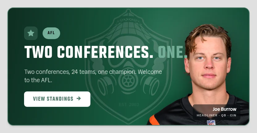
Sign in and the big card at the top of the homepage stops being league furniture and starts being yours — your franchise's gradient behind it, your crest sitting dead center, the headline and the player still riding over the top. It's the draft broadcast's reveal treatment, brought home.
The Full Story
For two years the top of the homepage has opened the same way for all forty of us. A deep navy card in the AFL, a deep blue one in The League, a red corner glow, a headline, a player cut out and floating on the right. Handsome. Also completely anonymous — the single biggest thing on the page you look at most, and it had nothing to say about who was looking at it.
Sign in now and that card is your franchise's. The background is your team's own gradient — the exact string the draft broadcast paints on the TV when your pick lands, not a second, slightly-different version of it — and your crest sits in the middle of the card at watermark strength, the copy crossing its left edge and the player crossing its right. Smokane opens green under the shield. The Pigskins open red under the pig. Midwestside opens damn near black with a gold ring floating in it, which is exactly right.
Everything on the card moved with it. The accent word, the countdown number, the pill and the border are all your team now, and the button went neutral white with your color as the type — no league gold, no league red, nothing borrowed. The border is the part that took the most fiddling: it runs a lighter cut of your color in dark mode and a deeper one in light, so the card lifts off the page either way instead of dissolving into it on one of them.
None of that is hand-picked, and it can't be — there are forty franchises and two themes, so somebody's headline was always going to end up unreadable if these were eyeballed. Every color is measured before it ships: the accent has to clear the contrast floor against the exact gradient it lands on, AND stay far enough from white that it still reads as an accent instead of melting into the headline around it. The pill's label is small type, so it's held to the stricter bar. A few teams needed a nudge lighter or deeper to get there and got one. Four franchises — Bring The Pain, Wabs, and the AFL's two — have no color in their palette at all, just black and white, so they get a bright silver, which is the honest answer rather than a hue nobody chose.
Two deliberate holdouts. Signed out, you get the league chrome exactly as it was — there is no team to wear, and a generic gradient pretending to be one is worse than honest navy. Picking a team on the AFL with the team switcher doesn't do it either: that sets which team the page is ABOUT, and a card in your colors is saying the site is yours, which should take an actual login. And the heroes that are ABOUT somebody else keep their own colors: the playoff bracket, the champion card, the live scoreboard and the weekly matchup already wear whoever is in them, and painting your red over a card announcing another owner's title would be a strange way to congratulate him.
Message